Creating a blog with Contentlayer Part 2
Faustino Zanetto
Post Author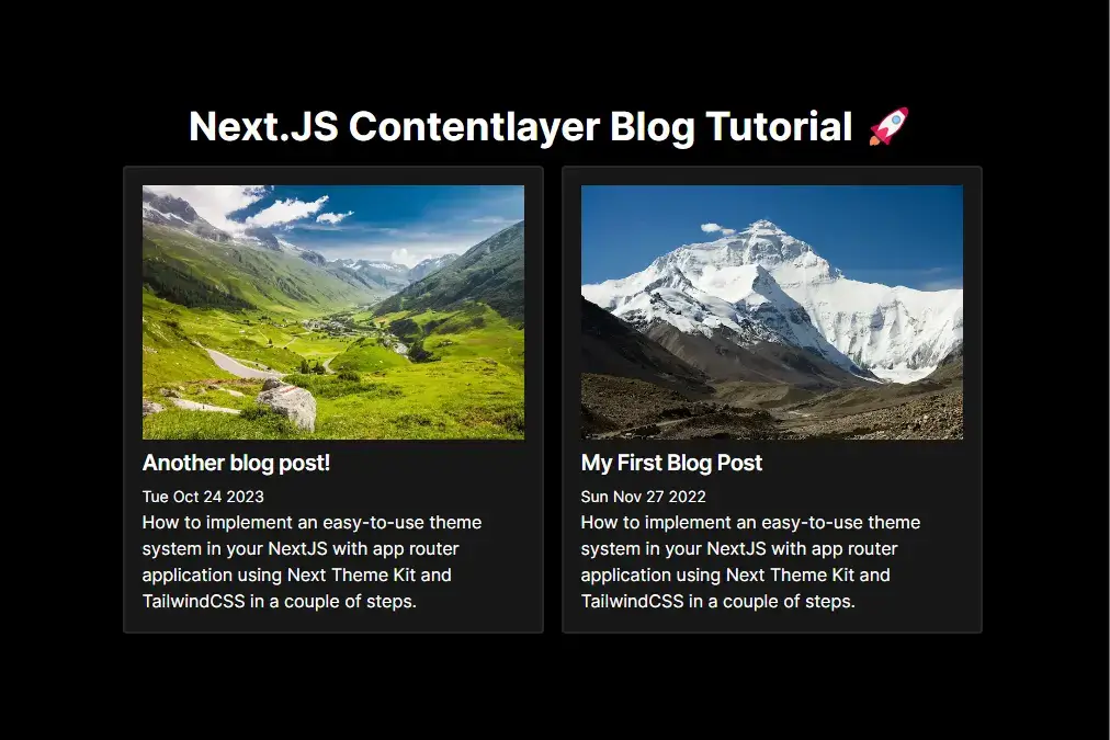
🌟 Introduction
In this blog post, we're picking up where we left off with our blog project using Contentlayer in the previous post. If you haven't had a chance to read part 1 yet, you can catch up by clicking here. This time around, our focus will be on introducing exciting new features like code highlighting, fine-tuning our styling, and diving into more advanced topics. Let's continue the journey! 😃🚀
📚 Prerequisites
Before we dive into the exciting developments in this part, I strongly recommend that you take a moment to ensure you've read and completed the walkthrough of part 1 in this tutorial. However, if you'd prefer to skip the previous part and get right into the action, you can conveniently clone the repository for part 1 directly from here. It's your choice! 📖🔗🚀
📦 Adding dependencies to our application
While we've successfully set up our basic dependencies for the blog, including the essential Contentlayer, to unlock the new features we're about to work on, it's crucial to install the following dependencies:
-
Installing Shiki
To enable syntax highlighting, let's start by installing Shiki:
pnpm install shikiShiki is a javascript library for managing Syntax Highlighting.
-
Installing Rehype Pretty Code
To ensure beautiful code blocks in your Markdown or MDX files, we'll need rehype-pretty-code. Install it with:
pnpm install rehype-pretty-coderehype-pretty-code is a Rehype plugin powered by the Shiki syntax highlighter that provides beautiful code blocks for Markdown or MDX.
-
Installing TailwindCSS Typography
Lastly, for enhanced styling on HTML elements that you don't have direct control over, we'll integrate TailwindCSS Typography. Incorporate it into your project with the following command:
pnpm install --D @tailwindcss/typography[TailwindCSS Typography] is a TailwindCSS plugin that adds styling to html that you don't control.
By adding these dependencies, you're equipping your blog project with a powerful set of tools to take your content presentation to the next level. 🚀📦✨
⚙️ Updating TailwindCSS Configuration
Now that you've successfully installed the mentioned dependencies, the next step is to ensure that your TailwindCSS configuration includes support for the Typography plugin. Follow these steps to make the necessary adjustments in your tailwind.config.js file, located in the root folder of your project:
-
Open your
tailwind.config.jsfile. -
Add the following lines to the configuration:
import type { Config } from "tailwindcss";

const config: Config = {
  // ... (other configuration options)
  plugins: [require("@tailwindcss/typography")], // Add this line
};
export default config;
By including require('@tailwindcss/typography') in the plugins array, you enable the Typography plugin within your TailwindCSS setup. This will allow you to apply consistent and appealing styles to various HTML elements in your project, enhancing the visual presentation of your blog content. 🎨💡✨
📄 Modifying our Content Schema
To enable support for new features like code highlighting, follow these steps to make changes to your contentlayer.config.ts file, which is located in the root folder of your project:
import { defineDocumentType, makeSource } from 'contentlayer/source-files';

export const BlogPost = defineDocumentType(() => ({
  name: 'Post',
  filePathPattern: `**/*.mdx`,
  contentType: 'mdx',
  ...restOfConfig,
}));
As observed, we've made two key modifications in this section. Firstly, we've updated the filePathPattern from .md to .mdx. This adjustment signifies a shift to using MDX files for our blog content. Secondly, we've introduced a new property, contentType, and set it to 'mdx'. This addition is crucial for informing Contentlayer that we are now working with MDX files as our content source.
🖋️ Updating our Posts Files
Following the extension type update in the previous section, we need to reflect these changes in our blog post files as well. To accomplish this, navigate to your content folder, which resides in the root directory of your project, and ensure that you modify the file extensions from '.md' to '.mdx'. This alignment ensures consistency and compatibility with the new MDX format.
Next we will create a new blog post to test out the new features we will be building in this part. To do so, create a new file in your content folder called another-post.mdx and paste the following code:
---
title: Another blog post!
description: How to implement an easy-to-use theme system in your NextJS with app router application using Next Theme Kit and TailwindCSS in a couple of steps.
image: /valley.webp
publishDate: 2023-10-25
tags:
  - nextjs
  - tailwindcss
---

# Testing a Code Block

Lorem ipsum dolor sit, amet consectetur adipisicing elit. Vero ipsam voluptatibus nihil laborum qui quia fuga voluptate autem sequi, nostrum dicta officiis culpa cum officia reprehenderit porro veritatis eligendi, at suscipit nemo voluptas ipsa sunt in voluptatem. Nostrum, id tempore, quaerat animi officia recusandae consequuntur impedit nulla, deserunt neque reiciendis!

```tsx showLineNumbers title="Testing Code Block"
import { allPosts } from '@contentlayer/generated';
import BlogPost from 'components/blog-post';
import { Metadata } from 'next';
import { notFound } from 'next/navigation';

type PostPageProps = {
  params: {
    slug: string;
  };
};

export async function generateStaticParams(): Promise<PostPageProps['params'][]> {
  return allPosts.map((post) => ({
    slug: post.url,
  }));
}

export async function generateMetadata({ params }: PostPageProps): Promise<Metadata> {
  const post = allPosts.find((post) => post._raw.flattenedPath === params.slug);

  if (!post) throw new Error(`Could not find post for slug: ${params.slug}`);

  const { title, description } = post;

  return {
    title,
    description,
  };
}

export default async function PostPage(props: PostPageProps) {
  const { params } = props;

  const post = allPosts.find((post) => post._raw.flattenedPath === params.slug);

  if (!post) notFound();

  return <BlogPost post={post} />;
}
```
This blog post contains a sample code block so that we can test the syntax highlighting we will be building in the following steps.
🛠️ Creating a new Blog Post Component
It's time to streamline our blog post rendering by relocating it from the blog post page to its dedicated component. To achieve this, we will create a new file named blog-post.tsx within the src/components folder. This architectural adjustment enhances the organization and maintainability of our project.
  ├──  src
      ├── components
        ├── post-card.tsx
        └── blog-post.tsx
Once you've created the blog-post.tsx file, proceed to copy and paste the following code into it. This code defines the structure and behavior of our blog post component, enabling us to efficiently render and present our blog posts in a clean and modular way.
'use client';

import React from 'react';
import Image from 'next/image';
import { Post as PostData } from '@contentlayer/generated';
import { useMDXComponent } from 'next-contentlayer/hooks';

const components = {
  Image,
};

type BlogPostProps = {
  post: PostData;
};

const BlogPost: React.FC<BlogPostProps> = (props) => {
  const { post } = props;

  const MDXComponent = useMDXComponent(post.body.code);

  return (
    <article className="prose dark:prose-invert container py-10 mx-auto max-w-5xl px-4">
      <div className="mb-8">
        <Image
          className="w-full bg-no-repeat object-cover mb-2 h-80"
          src={post.image}
          alt={`${post.title} Image`}
          width={500}
          height={500}
        />
        <h1 className="mb-1 text-xl font-semibold leading-snug tracking-tight">{post.title}</h1>
        <time dateTime={post.publishDate} className="mb-2 text-sm">
          {new Date(post.publishDate).toDateString()}
        </time>
        <p className="mt-1.5">{post.description}</p>
      </div>
      <MDXComponent components={components} />
    </article>
  );
};

export default BlogPost;
Lets break down whats going on in this component:
-
Import Statements: In this section, we import necessary modules, such as React, Image from Next.js, the Post type from Contentlayer, and the useMDXComponent hook from next-contentlayer/hooks.
-
Components Object: We define a components object, which is used to pass custom components to the MDXComponent. Currently, we've added the Image component from Next.js, but you can include more custom components here as needed.
-
MDX Hook Component: The useMDXComponent hook is essential for rendering the blog post content. It takes the
post.body.codeand returns aJSXcomponent that can be used to render the Markdown content. -
Return Section: This section returns the rendered blog post within an article element. The component uses CSS classes provided by the
tailwindcss/typographyplugin for styling. Additionally, it replaces the old div tag with the new MDXComponent to render the content.
<div className="[&>*]:mb-3 [&>*:last-child]:mb-0" dangerouslySetInnerHTML={{ __html: post.body.html }} /> // old tag
<MDXComponent components={components} /> // new tag
This BlogPost component makes it easier to manage and display your blog post content, and it also allows for the integration of custom components for a more dynamic presentation.
🧩 Updating Blog Post Page
Now that we created the new blog post component, we need to update the blog post page to fit this change. To do so, locate your page.tsx under the src/pages/posts/[slug] folder. Aftewards copy the following code:
import { allPosts } from '@contentlayer/generated';
import BlogPost from 'components/blog-post';
import { Metadata } from 'next';
import { notFound } from 'next/navigation';

type PostPageProps = {
  params: {
    slug: string;
  };
};

export async function generateStaticParams(): Promise<PostPageProps['params'][]> {
  return allPosts.map((post) => ({
    slug: post.url,
  }));
}

export async function generateMetadata({ params }: PostPageProps): Promise<Metadata> {
  const post = allPosts.find((post) => post._raw.flattenedPath === params.slug);

  if (!post) throw new Error(`Could not find post for slug: ${params.slug}`);

  const { title, description } = post;

  return {
    title,
    description,
  };
}

export default async function PostPage(props: PostPageProps) {
  const { params } = props;

  const post = allPosts.find((post) => post._raw.flattenedPath === params.slug);

  if (!post) notFound();

  return <BlogPost post={post} />;
}
As you can see, there are only a few changes from the old page. First, we imported our newly created component <BlogPost/> from the components folder as shown. Then we replaced all the return section of the PostPage function by just calling our component and passing post as props.
This updated code makes the blog post page more organized and efficient. It separates the rendering logic into a separate component for better maintainability.
Adding Code Highlighting
We've now reached a crucial part of our tutorial – adding support for code highlighting in your blog project. To enable this feature, you'll need to make some adjustments to your contentlayer.config.ts file, which is located in the root folder of your project. Follow these steps to implement code highlighting:
import rehypePrettyCode from 'rehype-pretty-code';

// rest of file

/** @type {import('rehype-pretty-code').Options} */
const rehypePrettyCodeOptions = {
  theme: 'min-dark',
};

export default makeSource({
  contentDirPath: 'content',
  documentTypes: [BlogPost],
  mdx: {
    rehypePlugins: [[rehypePrettyCode, rehypePrettyCodeOptions]],
  },
});
Lets break down what we've just modified here:
-
Import the Required Module: To start, we need to import the
rehypePrettyCodemodule, which allows us to use the code highlighting plugin in our project. -
Code Options Configuration: The
rehypePrettyCodemodule provides various options for configuring the code highlighting. In our case, we've updated thethemeproperty to use the 'min-dark' theme. You can explore and choose from different available themes; check out Shiki themes for more options. -
Update the
makeSourceFunction: We've made a slight modification to themakeSourcefunction. Specifically, we've added anmdxproperty within the function configuration. Inside themdxproperty, we've included arehypePluginsarray, which contains our newrehypePrettyCodeplugin along with its configuration.
This improved explanation provides a clearer and more structured guide to adding code highlighting to your blog project. It explains the purpose of each step and provides additional information on theme options for code highlighting.
Updating Blog Styles
Now that we've successfully integrated the rehype plugins for code highlighting, let's enhance the visual appeal of our blog post content with some additional styles. To do this, navigate to the styles.css file under the app directory in your project. Copy and paste the following CSS code to apply the styles:
/* Code block styles */
[data-rehype-pretty-code-fragment] {
  overflow: hidden;
  border-radius: 0.25rem;
  margin-top: 0.5rem;
  margin-bottom: 0.5rem;
}

/* Code block code tag styles */
[data-rehype-pretty-code-fragment] code {
  display: grid;
  min-width: 100%;
  overflow-wrap: break-word;
  overflow-x: auto;
  border: none;
  font-size: 0.875rem;
  line-height: 1.5rem;
  counter-reset: line;
}

/* Code block pre tag styles */
[data-rehype-pretty-code-fragment] pre {
  border-radius: 0.25rem;
  font-size: 0.875rem;
  line-height: 1.5rem;
}

/* Code block title styles */
[data-rehype-pretty-code-title] {
  color: rgba(255, 255, 255, 0.8);
  background-color: rgb(31, 31, 31);
  font-size: 1rem;
  line-height: 1rem;
  font-weight: 600;
  border-radius: 0.25rem;
  padding-left: 0.75rem;
  padding-right: 0.75rem;
  padding-top: 0.5rem;
  padding-bottom: 0.5rem;
}

/* Code block line numbers styles. */
[data-rehype-pretty-code-fragment] [data-line] {
  padding-right: 0.5rem;
}

[data-rehype-pretty-code-fragment] [data-line]::before {
  color: rgba(255, 255, 255, 0.5);
  counter-increment: line;
  content: counter(line);
  display: inline-block;
  width: 1rem;
  margin-right: 1rem;
  text-align: right;
}
Here's a breakdown of each section:
-
Code Block Container (
[data-rehype-pretty-code-fragment]): Defines overall styles for the container of code blocks, including overflow, border-radius, and margin. -
Code Tag Styling (
[data-rehype-pretty-code-fragment] code): Enhances the appearance of code content with a responsive grid layout, preventing overflow, and adjusting typography for readability. -
Pre Tag Styling (
[data-rehype-pretty-code-fragment] pre): Styles for the pre tag within code blocks, ensuring consistent appearance and readability. -
Code Title Bar Styling (
[data-rehype-pretty-code-title]): Styles for the title bar of code blocks, providing a distinctive look with color, background, font size, and padding. -
Line Numbers Styling (
[data-rehype-pretty-code-fragment] [data-line]): Adds spacing and styles to line numbers for better separation and readability.
In summary, these styles collectively contribute to a visually appealing and organized presentation of code blocks in your blog content. They improve readability, prevent overflow, and create a distinctive appearance for code snippets. Feel free to customize these styles to match your design preferences.
Next, navigate to the page to preview the changes. If you've followed the steps correctly, you should be greeted with something that resembles the following:
As evident, the previously applied styles are now visible in both the line numbers and the title section.
Conclusion
In this part of our tutorial, we've done some cool things to make our blog look even better. 🌟 We changed our file types to MDX, added some fancy features like code highlighting, and made everything look more stylish with TailwindCSS. 💻
Now, when you check out our blog, you'll see the code looks nice with cool line numbers and a fancy title. 🎨✨ But hey, we're not done yet! There's more exciting stuff ahead as we keep making our blog awesome. 🚀😃 So, stay tuned for the next part of our journey! 📝
Emoji Feedback
I'd love to hear your thoughts! Share your emoji reactions to this blog post with me. What's your emoji review? 😄👏👍🤔🎉
Share the Post
Spread the knowledge! Share this insightful blog post with your friends and colleagues on multiple platforms.