Introduction
In this blog post, we will learn how to implement a fully functional theme system using the new Next.js 13 App Router functionality. We will cover the primary topic of supporting themes, such as dark and light modes, using a new NPM package called next-theme-kit, which I have actually created myself
Prerequisites
To follow along with this tutorial, you will need nothing more than basic web development knowledge, especially using Next.js and TypeScript, as we will be using these two technologies. Optionally, having some prior experience using Tailwind CSS to style web pages would be beneficial but not required.
Setting Up NextJS 13 App
We will begin by creating our own Next.js app using a popular npm package called create-next-app. This CLI tool provides us with an easy-to-use command-line interface to bootstrap applications using this amazing framework.
To create a basic app we will execute the following command in our terminal:
yarn create next-appIf you have not installed this package before, the create-next-app package will be installed globally. Following that, you will be prompted with a series of questions regarding the configuration of the app. The first question will be about the name; you can choose any name you like. For example, "next-app-router-themes". Afterward, you will select "Yes" to all the questions regarding using TypeScript, Tailwind CSS, ESLint, the src/ directory, and App Router. Once you have answered all the prompts, the project will be ready to start implementing the theme system.
What is your project named? next-app-router-themes
Would you like to use TypeScript? No / Yes
Would you like to use ESLint? No / Yes
Would you like to use Tailwind CSS? No / Yes
Would you like to usesrc/directory? No / Yes
Would you like to use App Router? (recommended) No / Yes
Would you like to customize the default import alias? No / Yes
After the installation has finished, you will have the following files and directories inside the project folder:
  ├── public
      ├── next.svg
      └── vercel.svg
  └── src
      ├── app
        ├── favicon.ico
        ├── globals.css
        ├── layout.tsx
        └── page.tsx
  ├── .eslintrc.json
  ├── .gitignore
  ├── next-env.d.ts
  ├── next.config.js
  ├── package.json
  ├── postcss.config.js
  ├── README.md
  ├── tailwind.config.js
  ├── tsconfig.json
  └── yarn.lock
Configuring TailwindCSS
Now we will continue on to configuring TailwindCSS, to do this first locate the tailwind.config.js file in the root of your project and replace the existing code with the following:
// tailwind.config.js
/** @type {import('tailwindcss').Config} */
module.exports = {
  content: [
    './src/pages/**/*.{js,ts,jsx,tsx,mdx}',
    './src/components/**/*.{js,ts,jsx,tsx,mdx}',
    './src/app/**/*.{js,ts,jsx,tsx,mdx}',
  ],
  darkMode: 'class',
  plugins: [],
};
We made two changes to the code in tailwind.config.js. Firstly, we removed the theme extend that we don't need for this tutorial. Secondly, we added darkMode: 'class'. This is because we will be using classes to style our pages in dark mode. This configuration enables us to toggle dark mode using a class on the HTML root element, allowing for a seamless transition between light and dark themes in our Next.js app.
Next, we'll modify the globals.css file located in the src/app folder of your project. Replace the existing code in the file with the following CSS code:
  // globals.css
  @tailwind base;
  @tailwind components;
  @tailwind utilities;
We have removed all the default styling that comes with the create-next-app application, as it is not required for our implementation. This will allow us to have a clean starting point for building our theme system without any unnecessary CSS clutter.
Configuring Page
Next, we will recreate the project's page with a more basic design to facilitate testing out the dark theme. To do this, locate the page.tsx file under the src/app directory of your project. Replace the existing code in the file with the following simplified code:
// page.tsx
export default function Home() {
  return (
    <main className="flex flex-col text-center gap-2 items-center justify-center min-h-screen font-sans">
      <h1 className="text-5xl font-extrabold">😁NextJS App Router</h1>
      <h2 className="text-4xl font-bold">With Dark Mode</h2>
      <p className="text-lg max-w-md">Simple theme integration with NextJS, Next Theme Kit and TailwindCSS!</p>
    </main>
  );
}
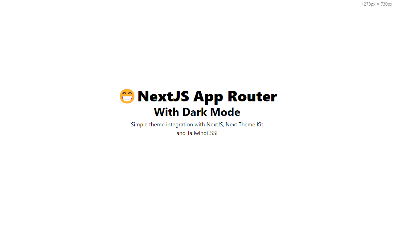
As a result, the home page will now have a more simplified design, ideally resembling the following:

Configuring Layout
Now that we have successfully updated the main page file of our project, it's time to introduce the next-theme-kit npm package. To get started, open up your terminal and follow these steps:
yarn add next-theme-kitAfter installing the package, we now have access to the components and hooks it provides, which we will use in the following steps.
Since we are using the latest Next.js 13 release, our layout.tsx file is a RSC or React Server Component. This means that we cannot simply wrap our component using a Provider or use traditional state management. To address this, we need to create a file called providers.tsx in the same location as the layout.tsx. For more information on rendering third-party context providers in server components, you can refer to providers.tsx.
// providers.tsx
'use client';

import React from 'react';
import { ThemeProvider } from 'next-theme-kit';

type ProvidersProps = {
  children: React.ReactNode;
};

const Providers: React.FC<ProvidersProps> = (props) => {
  const { children } = props;

  return (
    <ThemeProvider useLocalStorage useSystem={false}>
      {children}
    </ThemeProvider>
  );
};

export default Providers;
As you can see, we are using a declarative called "use client", which marks this file as client code. In addition, we have imported import { ThemeProvider } from "next-theme-kit"; to utilize the package we just installed. The code in providers.tsx is a simple React component that wraps the children prop with the provider, configuring some important props:
useLocalStorage: We enable local storage.useSystem: We disable system preference.
Of course, there are more props available, such as defining a defaultTheme or setting up additional themes beyond just dark and light.
With our providers.tsx file in place, we can now integrate it into the layout.tsx file. As a result, our layout will now look like this:"
// layout.tsx
import './globals.css';
import type { Metadata } from 'next';
import { Inter } from 'next/font/google';

import Providers from './providers'; // <---- Our Providers Component

const inter = Inter({ subsets: ['latin'] });

export const metadata: Metadata = {
  title: 'Create Next App',
  description: 'Generated by create next app',
};

export default function RootLayout({ children }: { children: React.ReactNode }) {
  return (
    <html lang="en" suppressHydrationWarning>
      <body className={inter.className}>
        <Providers>{children}</Providers>
      </body>
    </html>
  );
}
We made two changes to the previous layout.tsx file. First, we imported our Providers component and wrapped the children inside the return body, effectively integrating the theme provider into our layout. Additionally, we added the suppressHydrationWarning attribute to the HTML tag to prevent React from displaying warnings about hydration mismatch. For more information about this attribute, you can refer to suppressHydrationWarning.
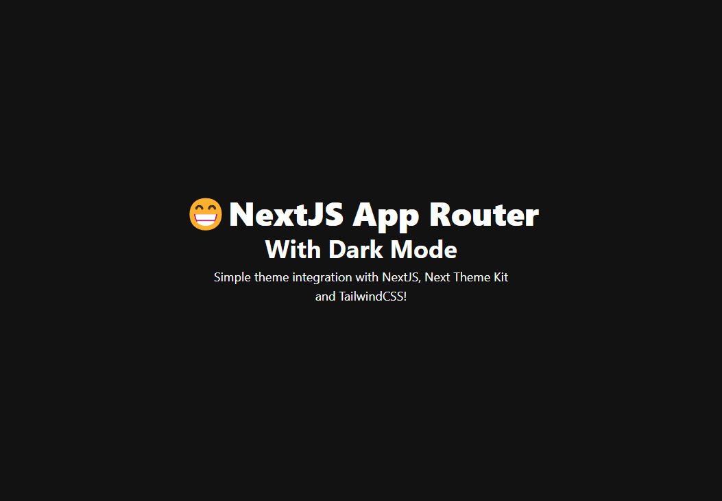
Now, if you start your application again, you will hopefully be presented with a dark background and light-colored texts. This indicates that dark mode is working successfully! 🎉"

Creating a Theme Toggler
We have almost everything configured in our application, but there's one more step: creating a custom component for toggling the dark mode on and off. To do this, let's first create a new directory called components under the src directory as follows:
  └── src
      ├── app
      └── components
Now that we've created the components directory, let's proceed by adding a new file called theme-toggler.tsx inside it. In this file, we'll create a simple component that renders a button. When clicked, this button will toggle between dark and light mode.
// theme-toggler.tsx
'use client';

import React from 'react';
import { useTheme } from 'next-theme-kit';

const ThemeToggler: React.FC = () => {
  const { theme, setTheme } = useTheme();

  return (
    <button
      type="button"
      aria-label="Toggle Theme"
      className="inline-flex items-center justify-center rounded-md font-medium bg-green-300 hover:bg-green-400 h-10 px-4 focus-visible:ring-green-400 dark:bg-green-800 dark:hover:bg-green-900 text-neutral-900 dark:text-neutral-50"
      onClick={() => {
        setTheme(theme === 'dark' ? 'light' : 'dark');
      }}
    >
      Toggle theme
    </button>
  );
};

export default ThemeToggler;
This code is a straightforward implementation of a client-side React component. At the top of the file, we mark it as a client component using the special directive "use client". This directive might be utilized by specific build tools to optimize client-side rendering.
The component imports two essential modules: React, the popular JavaScript library for building user interfaces, and the useTheme hook from next-theme-kit. The useTheme hook provides functionality for managing themes within the component.
Next, we create a React component called ThemeToggler, which requires no props. The component returns a <button> element with an onClick event handler.
We destructre the hook to get the current theme and setter using
const { theme, setTheme } = useTheme();.
Then on the
onClickhandler we define the following code:setTheme(theme === "dark" ? "light" : "dark");we basically check if the current theme is dark, if so we switch to light and viceversa.
Now that we created our component we need to use it on the page.tsx file, to do so we first import using the following code:
import ThemeToggler from '../components/theme-toggler';Then we add the component to the return body right below the paragraph close tag.
  </p>

  <ThemeToggler /> {/* <--- Our newly created component. */}
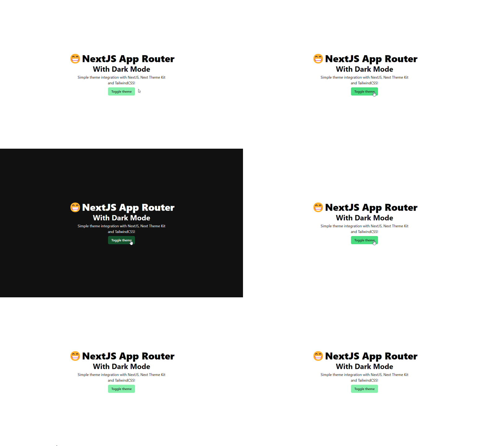
If everything went smoothly, the button should now be rendered on the page. When the button is clicked, the theme should switch between dark and light, thanks to the functionality provided by the useTheme hook from next-theme-kit.

By activating the useLocalStorage prop in our theme provider, we've enabled the selected theme to persist across page refreshes. Thanks to the smart handling of themes by next-theme-kit, users will no longer experience any theme flashing during page load. The useLocalStorage feature ensures that the user's preferred theme choice is stored in the browser's local storage. So, when they revisit the page, their chosen theme is seamlessly applied, providing a smooth and consistent user experience. This enhancement contributes to an improved user interface and a more user-friendly application overall.
Conclusion
Setting up themes in Next.js can indeed be tricky due to its server-side rendering (SSR) nature. If you choose a simple context and hooks approach for managing themes, you may encounter flickering issues during page loads. This happens because the server doesn't have information about the current theme, causing React to wait for rendering the UI until it can access the theme.
Fortunately, the next-theme-kit package offers a solution to this problem. It uses a custom script tag under the hood, which intelligently retrieves the current theme from local storage. As a result, React no longer needs to wait to render the UI before accessing the theme information.
By leveraging this capability, next-theme-kit ensures that the theme-switching process is seamless, without any flickering or visual glitches during page loads. It provides a reliable and user-friendly solution for managing themes in Next.js applications, making the overall development experience smoother and more enjoyable.
Thank you for exploring the theme setup in Next.js and learning about the benefits of using next-theme-kit to avoid flickering issues during page loads. If you're interested in diving deeper or want to try it out yourself, the complete code and implementation are available in the repository: repository.
Feel free to check out the repository, contribute, or raise any issues you might encounter. Happy coding! 🚀
If you encounter any issues or have suggestions while reading the article feel free to open an Issue at my repo. Thank you for taking the time to read the article! 🤗
Emoji Feedback
I'd love to hear your thoughts! Share your emoji reactions to this blog post with me. What's your emoji review? 😄👏👍🤔🎉
Share the Post
Spread the knowledge! Share this insightful blog post with your friends and colleagues on multiple platforms.